Pre K has spent several weeks making a variety of different collages which culminated in a finger puppet project. We used our excellent arranging and gluing skills and applied them to the printmaking process of Collagraphy. Next, we briefly discussed how printmaking is different from other types of art making. because it allows the artist to repeat a design OVER and OVER and OVER again! Students used a variety of different textures to work with such as fluffy yarn, smooth paper, foamy shapes, and rough cardboard to glue to create our printing plate. However, the the bubble wrap was by far the most popular and very temping for kids to pop! Students learned and practiced how artists use a brayer to spread the paint/ink all over their plate and then rub all over their plate to create an impression. The most exciting part for students was when it came time to peel off their paper and see their design repeated on their print.
Thursday, February 13, 2014
Pre K Printmaking with Collagraphs
Pre K has spent several weeks making a variety of different collages which culminated in a finger puppet project. We used our excellent arranging and gluing skills and applied them to the printmaking process of Collagraphy. Next, we briefly discussed how printmaking is different from other types of art making. because it allows the artist to repeat a design OVER and OVER and OVER again! Students used a variety of different textures to work with such as fluffy yarn, smooth paper, foamy shapes, and rough cardboard to glue to create our printing plate. However, the the bubble wrap was by far the most popular and very temping for kids to pop! Students learned and practiced how artists use a brayer to spread the paint/ink all over their plate and then rub all over their plate to create an impression. The most exciting part for students was when it came time to peel off their paper and see their design repeated on their print.
Wednesday, February 12, 2014
Fantastic Fonts
Fourth grade learned how a typographer is a
type of artist that designs the way letters look and is a career for artists in
the field of graphic design. As an exploration into typography, we
used a Google
app called Instafont,
which allowed students to draw on their tablets and create their own font which they used to write a letter to a friend. Next,
we spoke about how designers choose different fonts to convey different
messages. Students looked at a variety
of fonts and described how they thought the font would be used. Most students agreed a spooky font would
not be appropriate for a report card or letter home to a parent, rather as a title on a horror book would more suitable.
To give us more inspiration, we examined illustrations from
the book The
Graphic Alphabet,
advertisements, and even the letters on the T shirts we were wearing that day. After looking
at numerous examples of fonts, we discussed the difference between a serif
and sans
serif. Students learned how “sans”
is a
French word for without, meaning without serif, or the shape at the end of
letters that are usually rectangular.
Finally students were ready to start
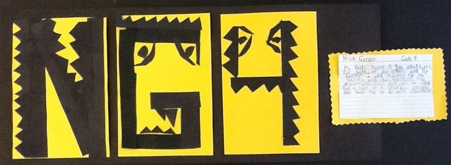
their own fonts by choosing letters from their names (if time a favorite number) with black strips
of paper,
scissors and glue. After
creating their first letter, students thought about their visual themes they
incorporated such as
( wavy lines, spikes, cut out holes) and
continued them in their next letter and/or number. The last step was to look at how other artists use text in their work such as Robert
Indiana in
his famous
Love sculpture
and discussed why so many artists have reused his design over the last few decades. Lastly, students mounted their own artwork, working hard to show craftsmanship
and
wrote several sentences
giving
their font a title, discussing the
visual themes, and where they
would use their font (movie premier poster, birthday invitation, or T-Shirt). A special shout out to a wonderful art blog http://wemakeartatps10.wordpress.com/ that inspired this lesson!
Robert Indiana
"Angel Spirit"
"Archery Shooters"
"Ocean Breeze"
"Bunny"
"Cuts and Holes"
"Dinosaurs At Night"
"Eaten Fruit"
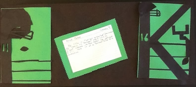
" Football on the Field"
"Green Meadows"
"Hawaiian Breeze"
"Sharp Hangs"
"Icy Mountains"
"Branches on a Tree"
"Jewels"
"Jug"
"Killer Whale"
"Crocodiles At Night"
"Mountains"
"The Barbershop"
"Nature"
"Sky High"
"Sneak"
"South Carolina"
"Teeth"
"When it Rains"
Tuesday, February 4, 2014
In my __________ shoes I like to __________.
Each student was given the sentence to fill in "In my ______ shoes I like to ________," for their second painting (they completed their family portraits prior to this). An art teacher friend of mine gave me this idea to inspire students to start thinking about what their body looks like when it bends in an effort to break away from the traditional figure that has there legs apart and their arms down. Within seconds of this prompt, students had tons of ideas! We even practiced posing in those positions to help us translate what part of our body was actually bending and what was straight. Since we were continuing to study Fernando Botero and Mary Cassatt we looked at some great examples of bodies bending in their work. See our wonderful results below (painting might be second grade's sweet spot).
I like to play basketball in my sneakers.
I like to play basketball in my Jordan's
I like to dance in my ballet shoes.
I like to play football in my cleats.
I like to play football in my sneakers.
I like to play hockey in my ice skates.
I like to go to horseback riding in my riding boots.
I like to skate in my ice skates.
I like to do Karate in my bare feet.
I like to play soccer in my cleats.
I like to play soccer in my cleats.
I like to swim in my flippers.
I like to go swimming in my bare feet.
I like to ride my toy car in my sneakers.
Subscribe to:
Comments (Atom)


